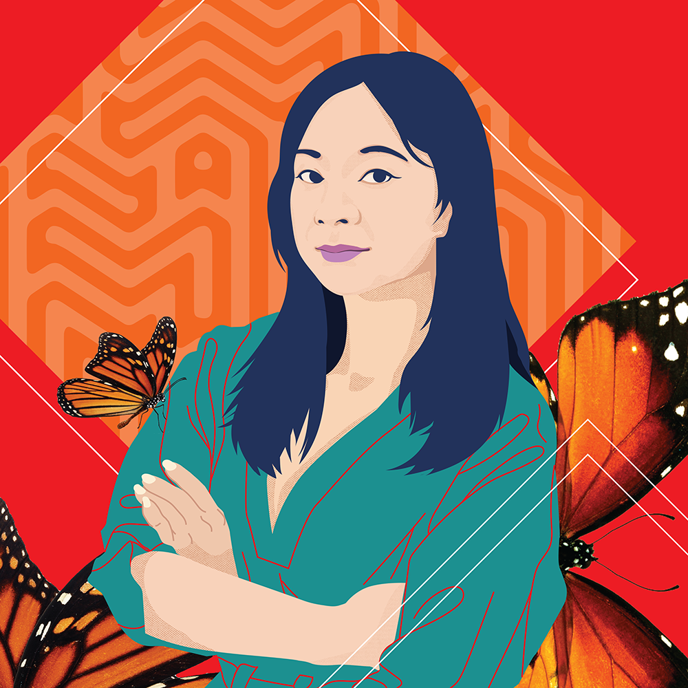
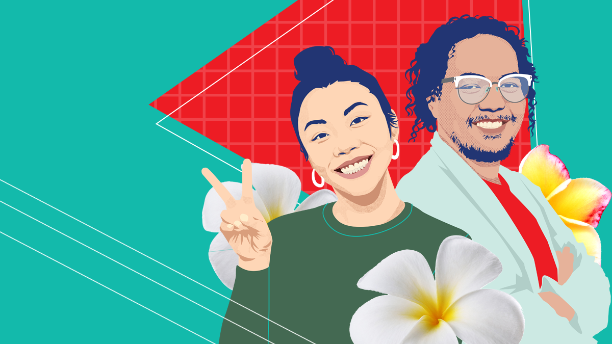
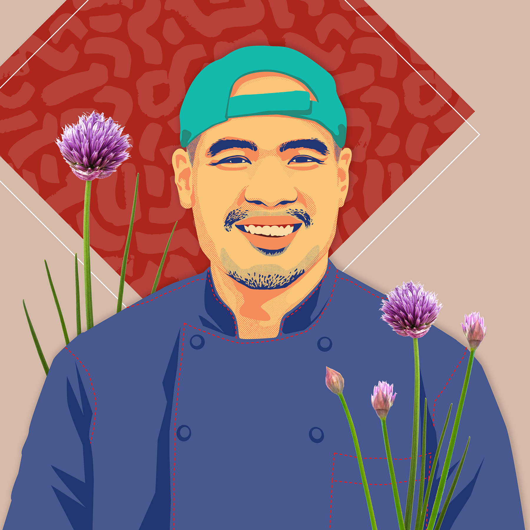
Graphic Designer, Artist And Creative Director Andre Sibayan On Filipino American Design
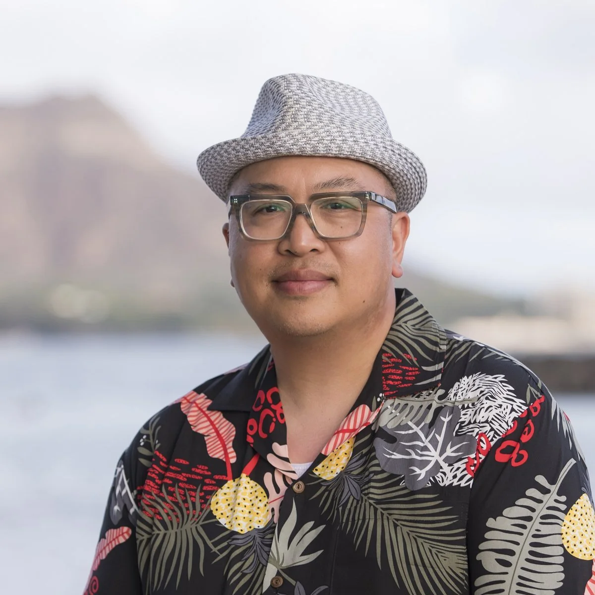
A humble visionary who is helping set the standard for Filipino American design, he is the Creative Director for Kultivate Labs, a non-profit Economic Development and Arts Organization in San Francisco’s Filipino Cultural district called SOMA Pilipinas (South of Market Area neighborhoods).
Born and raised in the San Francisco Bay Area, Andre Sibayan has 20+ years of professional design and community organization experience.
Having graduated from the Academy of Art in San Francisco, studying drawing and painting, he received his Bachelors of Fine Arts in Illustration. With an extensive background working for household brands like GAP Inc, Disney, Quiksilver, Target, Penguin/ Random House, Playboy Magazine, etc.
In retrospect, it wasn’t so much the education that brought the opportunities in his life, it was his desire to connect through passion and forming long-lasting friendships that proved to be the roots of his successes.
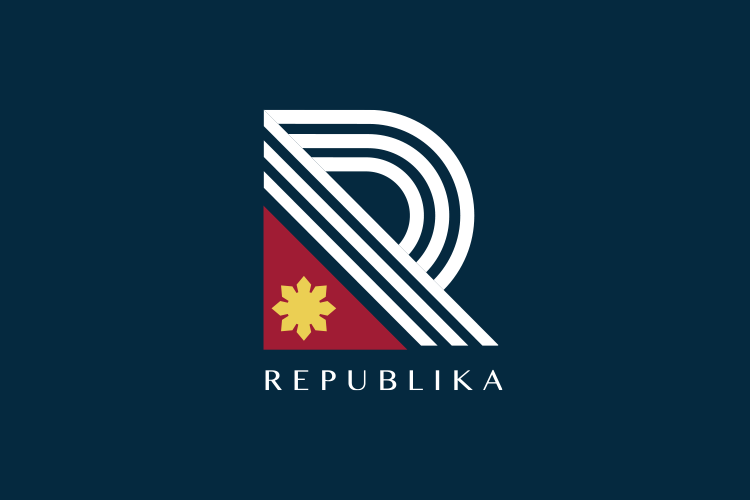
Sibayan is in conversation with Jimmie Flora — discussing Filipino American Design and defining the branding fundamentals and creative direction for Kultivate Lab projects, UNDSCVRD, Kapwa Gardens, Stevenson St., Republika.

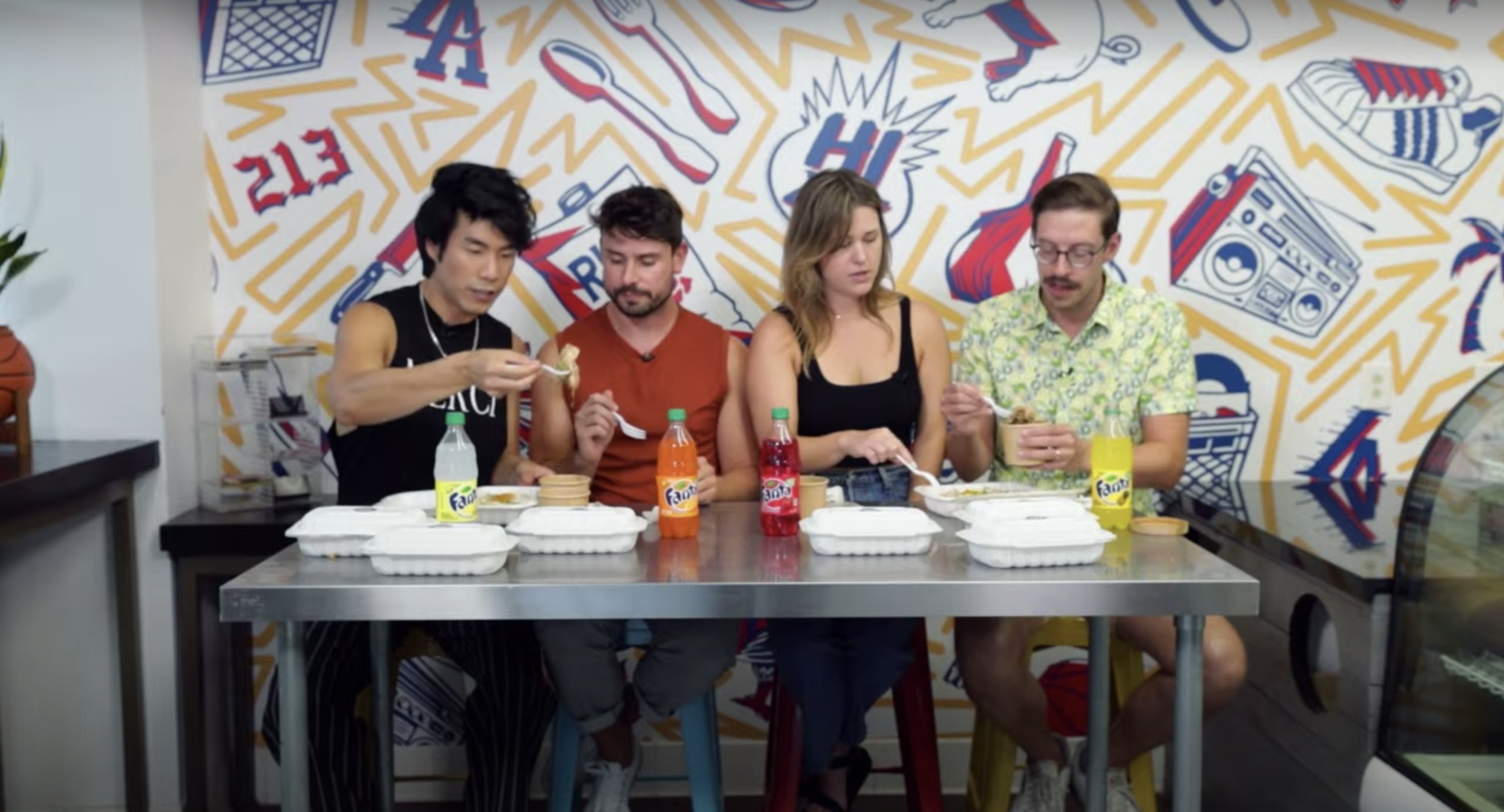
Undiscovered Creative Night Market in SoMA Pilipinas, San Francisco, 2018
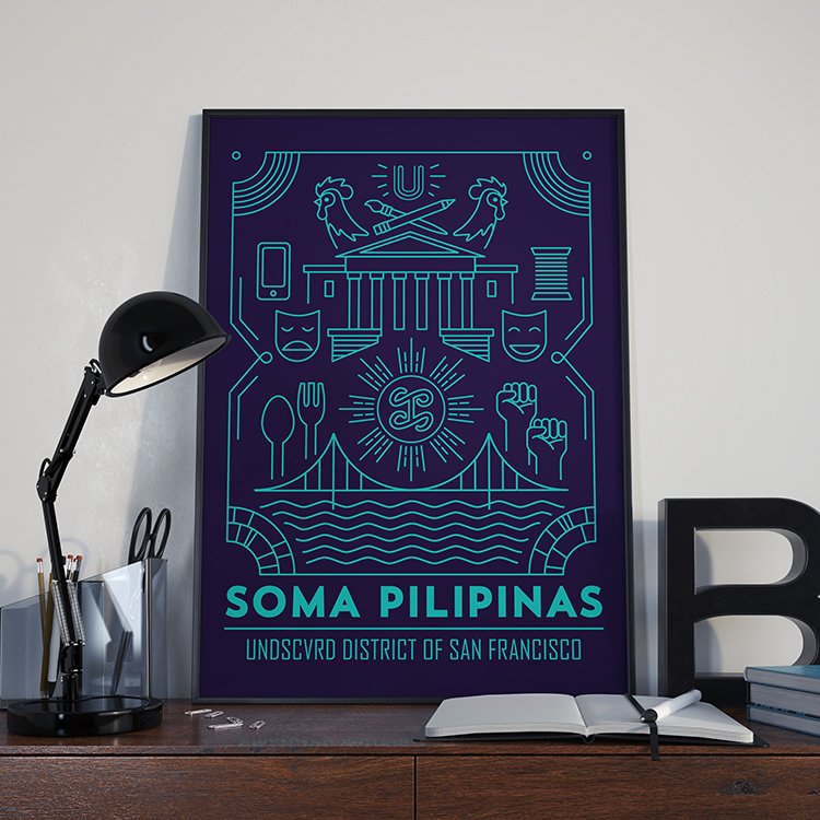
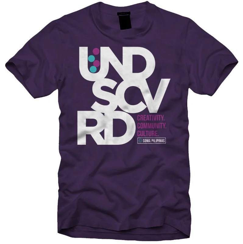
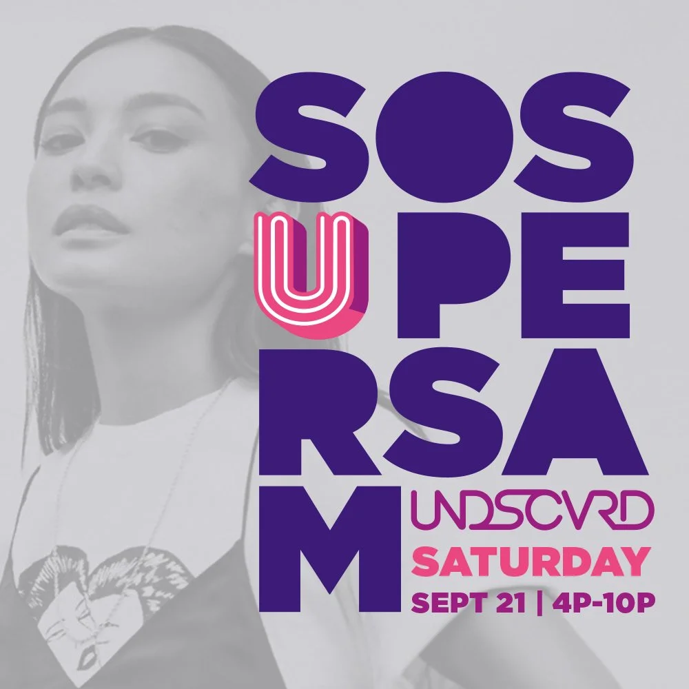


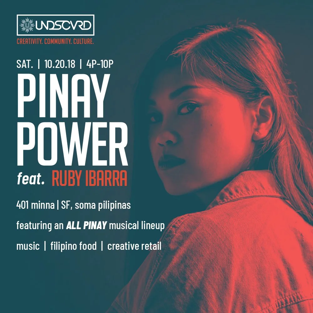


UNDSCVRD brand assets 2017 -2021 - Art Direction + Design by Dre Sibayan
Dre Sibayan: I think the challenge for me at the beginning of all this was, OK, I've been doing all this design, but now I'm doing a lot of design for the Filipino Community.
JF: Yeah, What does that even mean? I think this is the question that gets asked with a lot of Filipino culturally based projects.
DS: The real crux of that is, how do I show people that I am Filipino, that this organization is Filipino?
But also that we’re new. To show we are today, and not what we’ve always been known for.
The big conundrum is — we get the same issues showing up with client conversations, how, “we got to have a flag in there”. “we've got to have some stars”. You know, being confined by these common Filipino design tropes that we tend to always see.
We're thinking about, “How do I appeal to Filipinos both abroad and here”?
When we really need to look at it from BEING Filipino.
Because if you yourself are of that culture – whatever you design or create is Filipino-American culture.
By having pride in my heritage, I'm already giving back my props, my nod to the motherland.
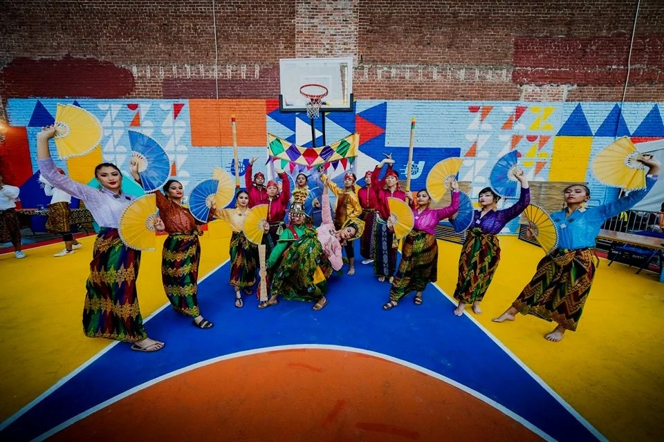
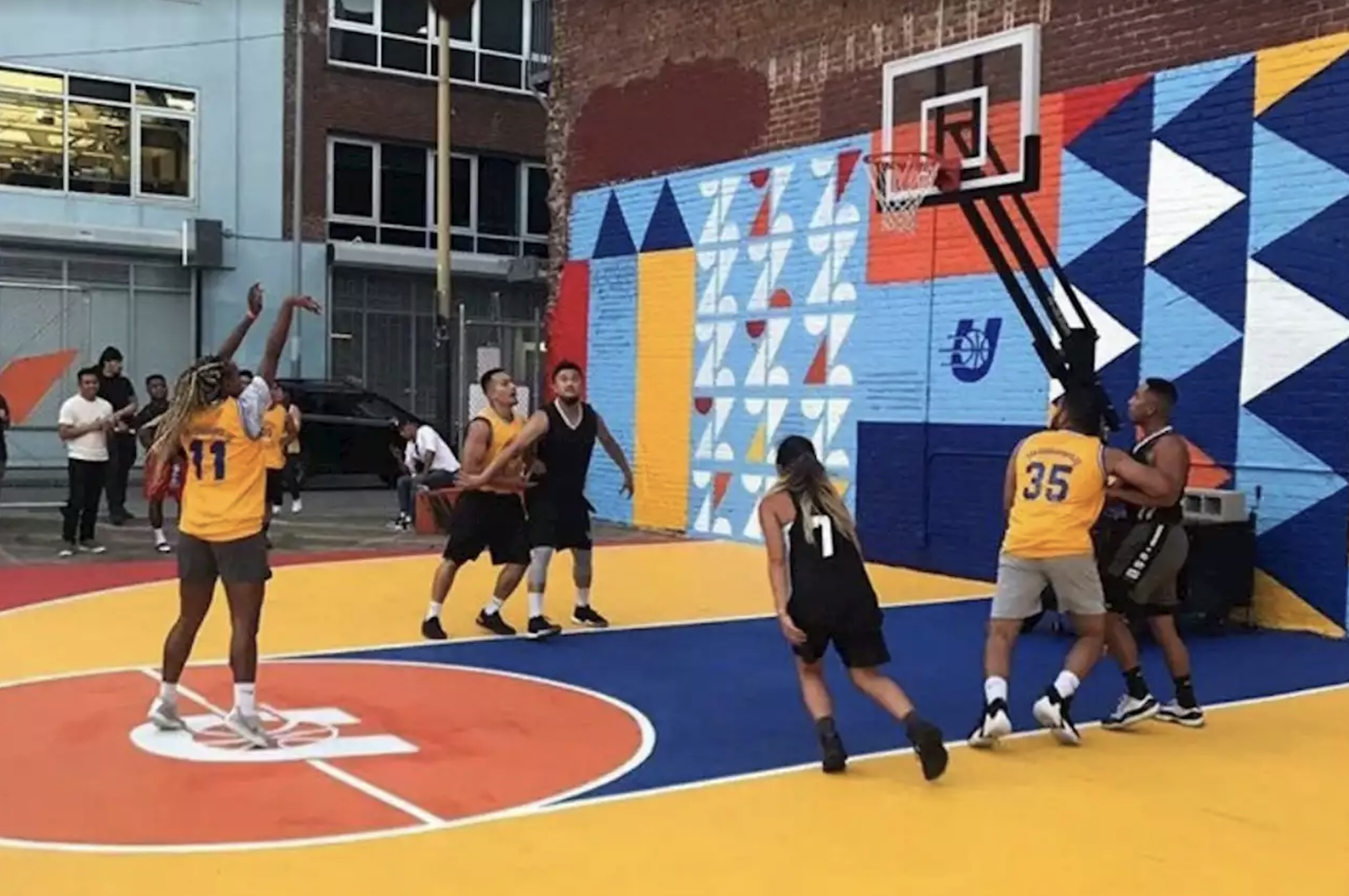
Undscvrd Court, SOMA Pilipinas 2019, Creative Direction by Dre Sibayan
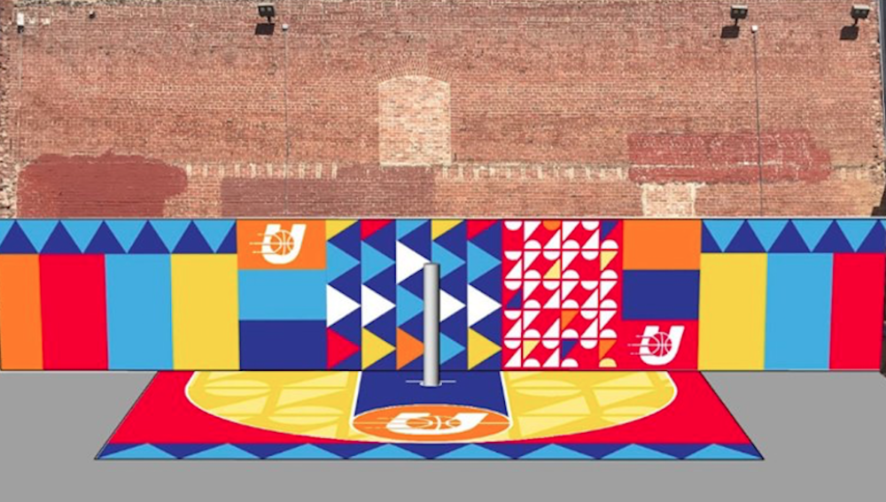
Early Renderings based on Philippine Vinta Sails
The fact is – I am Filipino American. I was born and raised here. I add to the culture by being an American and being a Filipino. The work that goes through me is my contribution to it. I had to realize that whatever I say as a Filipino American IS Filipino American.
By the actions of me doing it.
It's not just in design, but by being confident in our decision-making. Things look the way we want them to look through our own eyes.
The future of Filipino design is that you'll have this vast vocabulary of varied styles and voices that are Filipino American by heritage of their creators, but are just different in the way that they look and sound.
And that's good because we’re creating this wide palette of style and dimensionality to Filipino American design. When you hear someone say ITALIAN DESIGN, what comes to mind? When you hear GERMAN ENGINEERING, what do you think? In both cases you think of it being top quality or best in class.
Basically, EXCELLENCE. Hopefully, if not now, but in the future when you hear or read someone mention FILIPINO DESIGN (culturally related or not), you think EXCELLENCE.
BROWN EXCELLENCE.
Various branding for businesses + orgs in SOMA Pilipinas - Art Direction + Design by Dre Sibayan

Marharlika concept flag by Dre Sibayan
JF: So whenever I think about the SoMA District from the outside-in or San Francisco’s Filipino cultural and arts movement, I find parallels to what happened during the Harlem Renaissance in New York, in relations to the flourishing artist movement where our [black brothers and sisters] had the space and the freedom to express themselves as this black cultural mecca in the 1920s and 1930s.
You’re saying that Filipino American, especially in the diaspora here in the Bay, in the modern art aspect is that we're able to express ourselves freely and what we create out of it and who we’re creating it for is naturally Filipino American. We're not having to always refer back to things of the past for it to be relevant to us.
The modern aspect of Filipino art and design is that we are moving forward. We’re healing from traumas and speaking more about the joy and the creation. We live in diverse communities and have friends and family that are every color of the rainbow. Now we have all these different facets of life, which IS all part of that Filipino-American experience, so our stories are new!
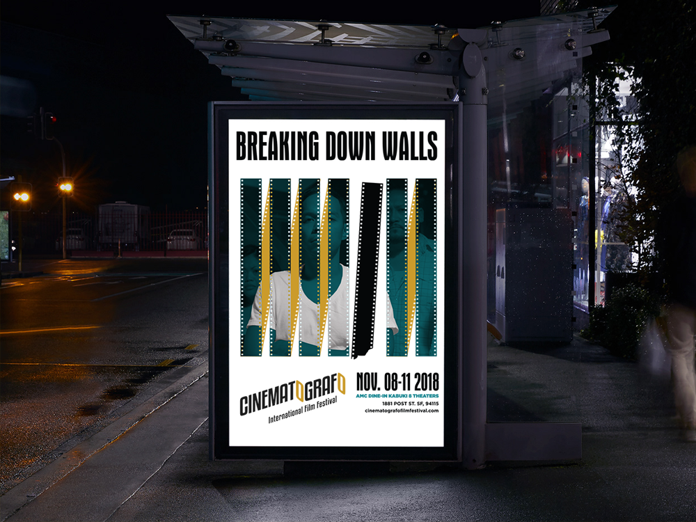
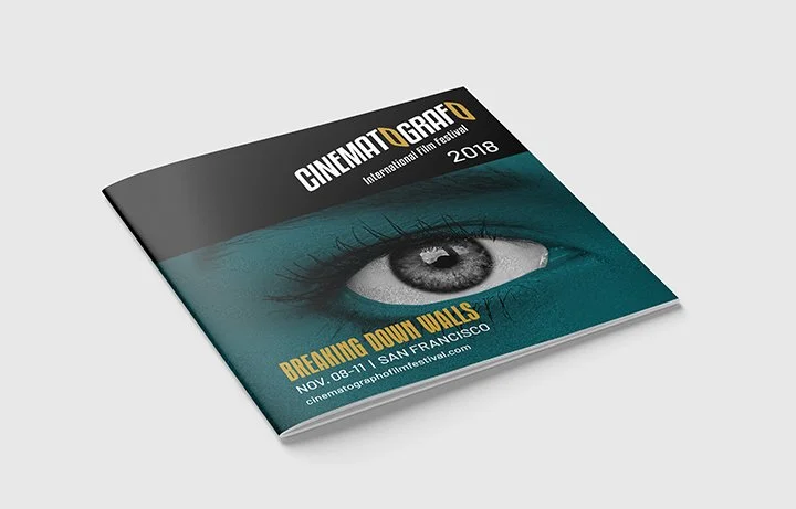
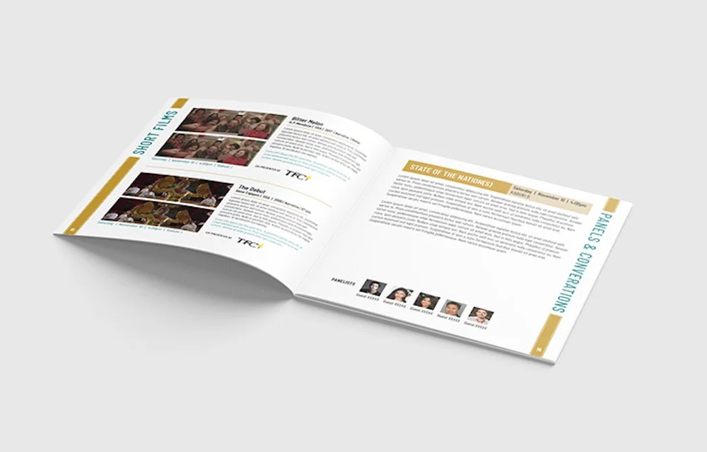
In 2017, ABS-CBN created the Cinematografo International Film Festival in San Francisco to help reach the younger Filipino-American audience. In 2018, Cinematografo expanded their programming to feature shorts, documentaries, and films from around the globe.
Incorporating elements of Blue Note into the new poster and festival program gave Cinematografo instant familiarity with American audiences along with the sense of creative innovation associated with the historic jazz label.
Art Direction by Dre Sibayan.
DS: A lot of my knowledge of Filipino history isn’t from immigrating here, but the trials and tribulations of Filipinos faced while here.
My knowledge of Filipino history comes from my relationships. My friends and family.
Having a lot of friends who are not only educators, but activists —
I’d hear the term “DE-COLONIZE” a lot.
“DE-COLONIZE your mind. DE-COLONIZE your language.”
I’ll be honest. I went to art school and didn’t have the benefit of a class that would shed some light on this subject, so it took me a while to get it.
To me, part of that colonized way of thinking is being burdened to do things a certain way, because that’s just how (in our memory) it’s always been done. We, have it deeply ingrained into us that we have to make our ancestors proud and follow traditions to the letter.
Straight up Lola guilt. That sh*t weighs on you.
So if I'm designing something for the Filipino that means I better include some suns and stars and red and blue, right? Where are the sun rays? There is that unspoken level of, “I owe it to my people to do things the way that they did it so that they know I'm not just dismissing them.”
And it's until you give yourself permission not only as an individual artist, but as a culture where we can move forward. We have to acknowledge that those things happened and we’ve got to move on positively, right?
We need to give ourselves permission to BE.
I'm sure other Asian cultures and other ethnic cultures, in general, have that underlying attitude of honoring their ancestors from their traditional customs & practices. I can only speak to the Filipino experience because that's who I am. But I also love comic books, and anime, and hip-hop, and the outdoor…it’s all part of the inspiration halo-halo.
My design is drawn from the essence of my own Filipino American experience and being able to pay respects in my own way.
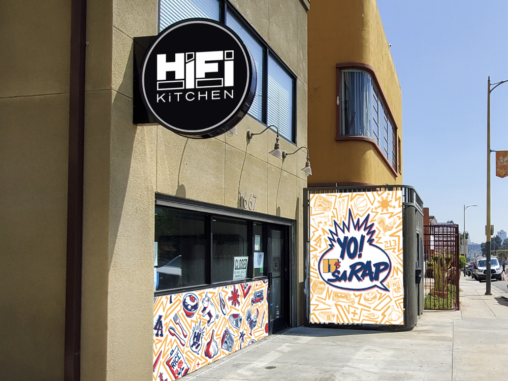
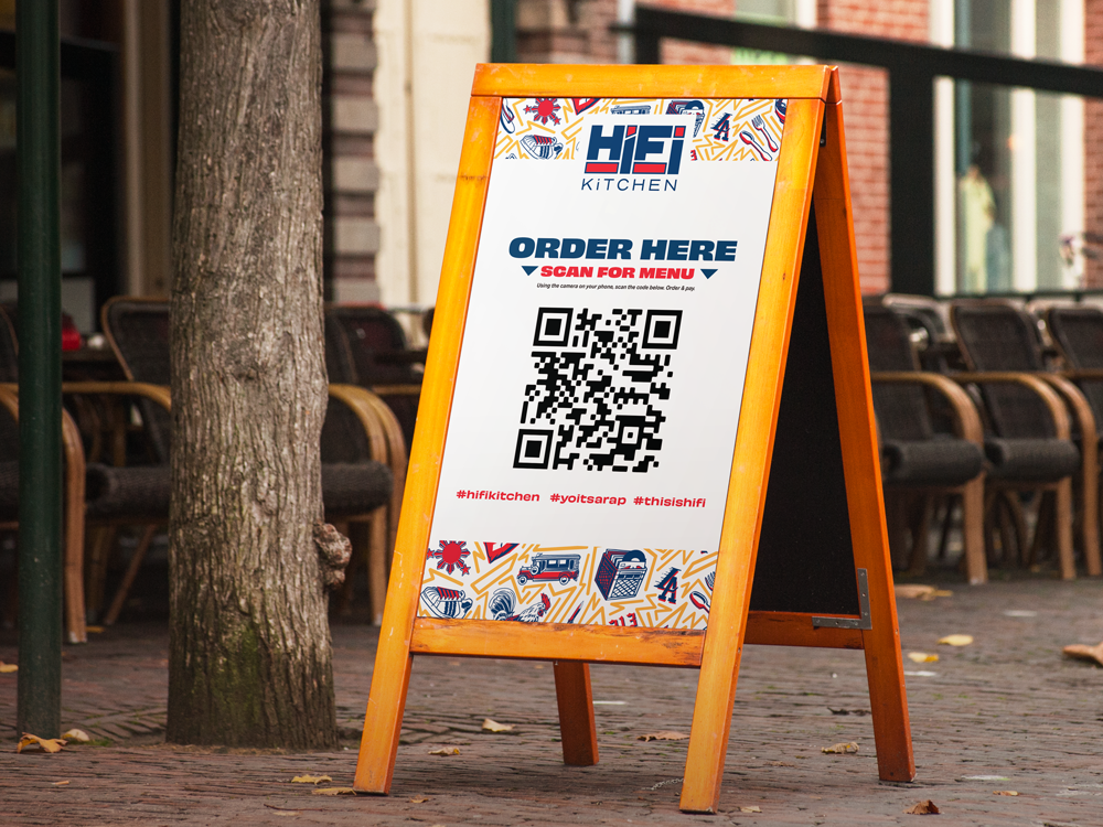
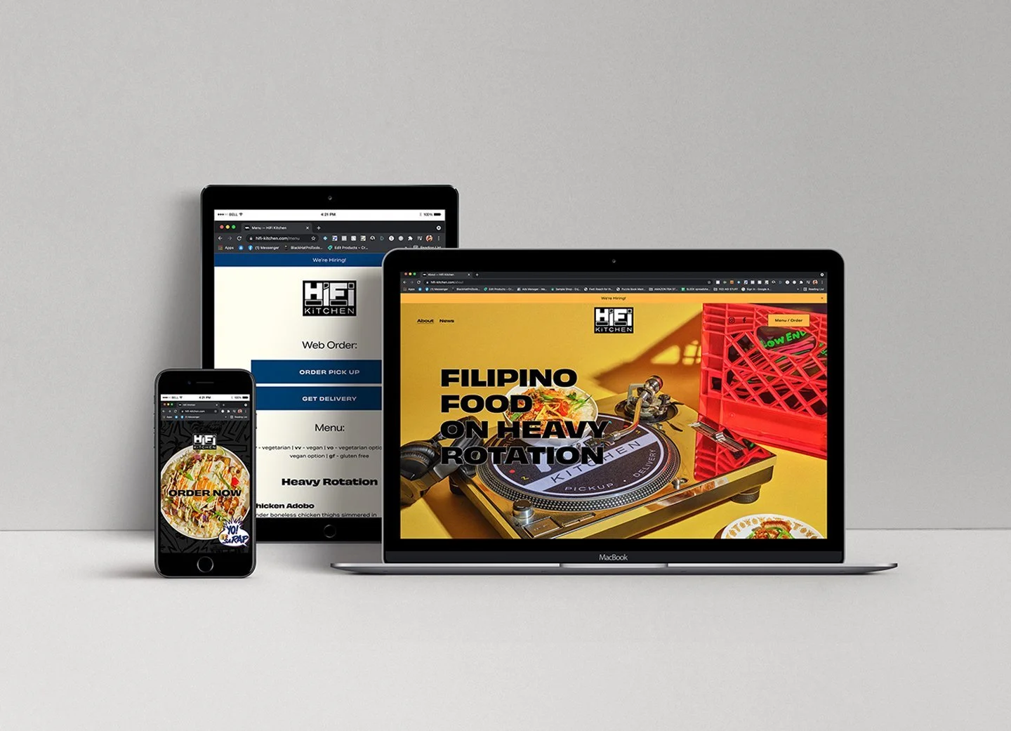
HIFI Kitchen (in Historic Filipinotown Los Angeles) branding - Art Direction by Dre Sibayan
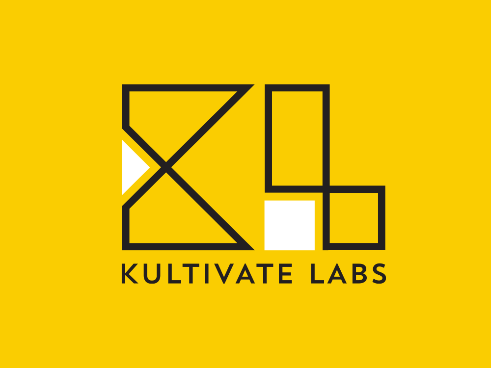
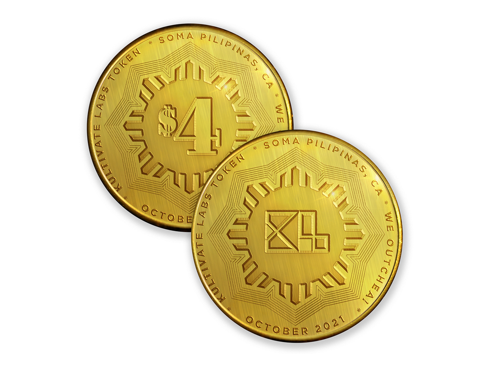
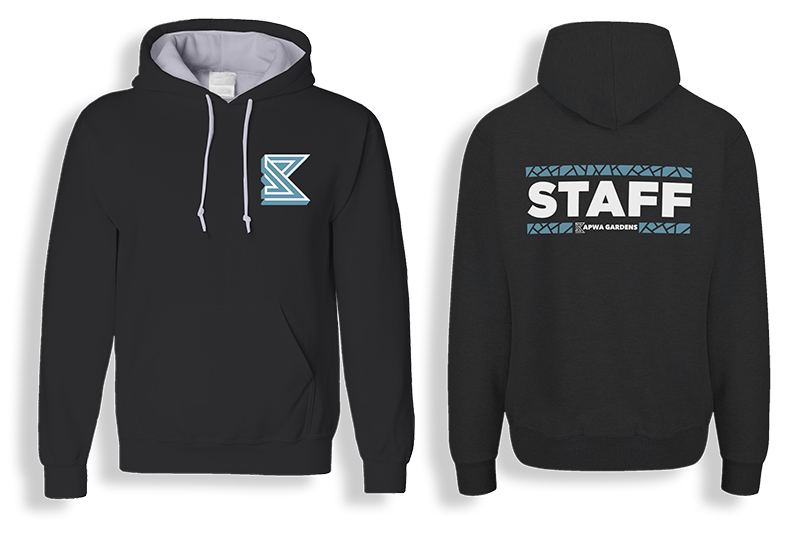
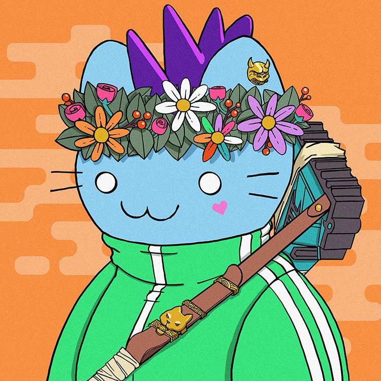
Kultivate Labs Logo + Tokens - Art Direction by Dre Sibayan
Dre Sibayan: So with Kultivate Labs and with Undiscovered at the beginning, I think the challenge was, how do I make this Filipino without it being cliché?
It was Desi who really pushed me in terms of not being overtly Filipino.
“Let's be this other thing”
“Let's just be Filipino by our actions”.
JF: Taking it down to core branding — what colors did you want to be known for?
DS: What I’ve learned in my journey of developing visual branding is that logos and branding should be about identification, not an explanation.
I wanted to obviously pay homage to the roots of being Filipino but without the red and blue. So I latched on to the color yellow in the way that Starbucks is green in the way that Nike is orange in that orange box, right?
Like the way that Coke is known for being red, Kultivate Labs is associated with yellow.
The same thing with Undiscovered, they’re memorable for being purple and teal.
When you look at the Undiscovered logo, it looks like a record label. It doesn't look like a Filipino events company or organization. And I think that is more important because with both organizations, what we're trying to accomplish is not only uplifting our community but becoming visible within other communities.
Like, THAT is Undiscovered, and they just so happen to be a Filipino-American night market that sparks economic activity within SoMA Pilipinas.
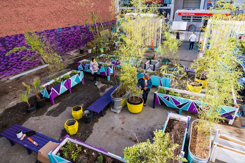
JF: How about Kapwa Gardens design?
DS: So designing Kapwa Gardens happened around the time my mother passed away. Just to be transparent.
The color palette of Kapwa Gardens was 100% taken from the colors my mom loved — she loved to wear bright floral shirts.
My mom passed away in October 2020. Early in 2021 Desi had asked me to work on a project he had been planning the previous year.
I don't know why I asked, but I was like, “Hey, is it cool if I made the color palette dedicated to my mom somehow?”
He was like, “Yeah of course, go for it.”
I don't know if anyone knows this. And I don't know if I said this out loud before,
but it was really a way for me to heal during that time. I cut myself off from friends, social media. Everybody. I didn’t want to hear about anybody else’s news. I just wanted to be with my family and my feelings.
After my mother had passed.
I just kind of threw myself into work. It was the only way I knew how to deal with all of those emotions and focusing on the lively fun emotions of the memory of my mom.
That’s what drove the inspiration for Kapwa Garden’s branding and design.
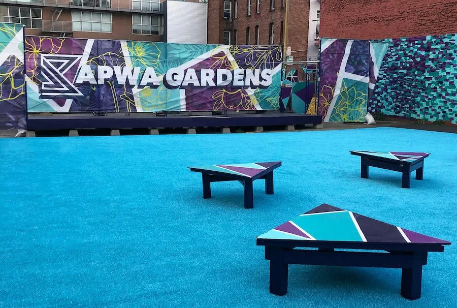
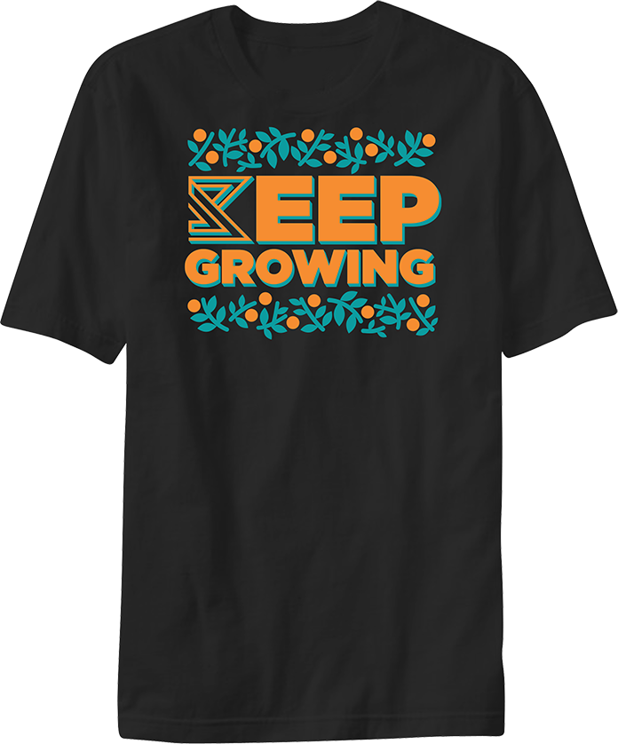
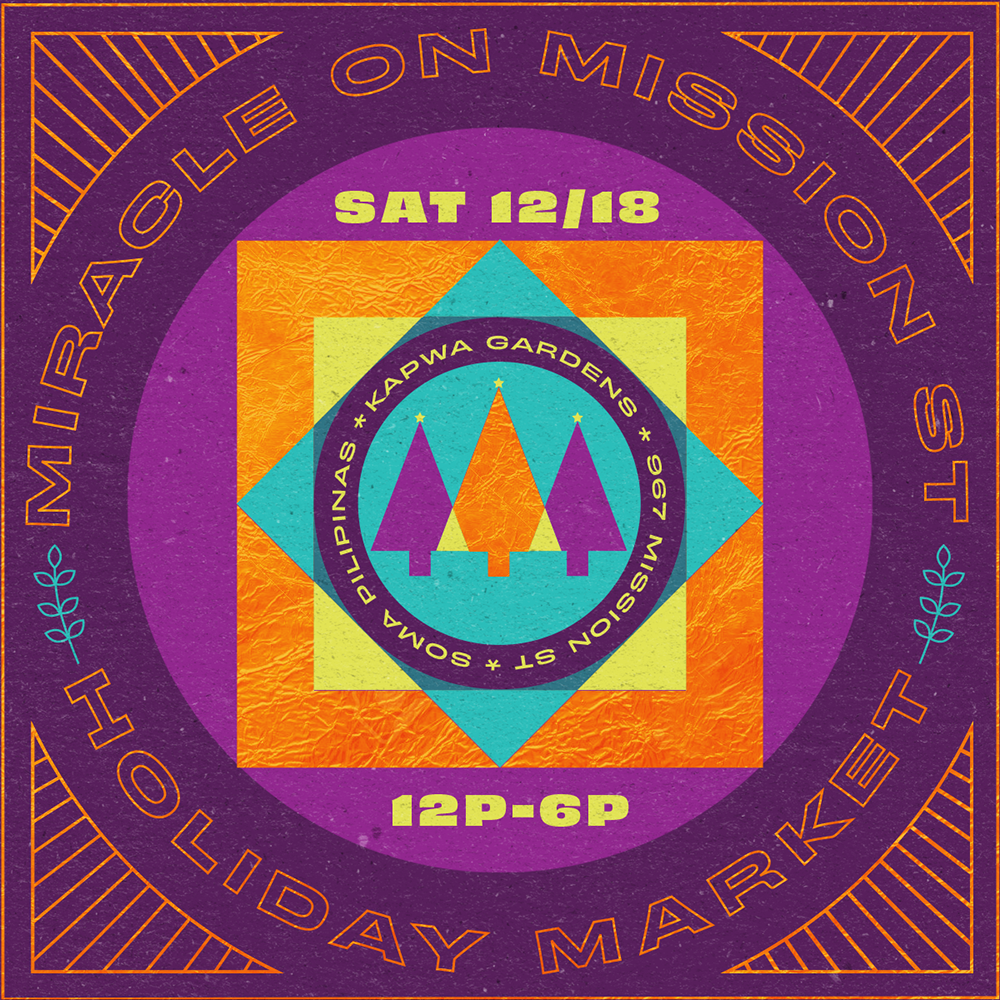
Kapwa Gardens brand assets and promotional items - Art Direction by Dre Sibayan
It was proposed to be this oasis in a rough neighborhood in SF that was made even more challenging to be in through the pandemic.
How do we make it feel more positive? How do we make it feel more inviting?
How do you make it feel like it's a space that feels loved?
And so that particular project was drawn out of the emotions that I was feeling at the time. I took a bit of that purple from Undiscovered and the teal as the garden as this oasis among the concrete jungle of San Francisco.
So hopefully that comes across without all of the plants, without all of the great programing that comes across there.
What I wanted to accomplish from the design perspective was to convey an energy of positivity and optimism within that space.
JF: Thank you for sharing that. With healing, it's interesting, as a multidisciplinary artist, the way that the creation itself is a form of healing. So creating the color palette and the look for Kapwa Gardens was a way for you to heal. That’s beautiful.
It feels full circle from designing Kapwa Gardens for the community by bringing people together as a healing space.
This part of the design process is very vulnerable. It is the human aspect of design. Very critical and not just about the final product.
DS: You know, a lot of times when you start, when you start doing art or design for a living, the product that you create feels completely contractual, right?
Like, “I just need to get done with this so I can get paid and get on to the next thing.”
Not to derail the conversation, but I think that's a big learning process for anyone getting into any creative field for a living.
Doing what you love to do inherently changes your relationship with that thing that you love doing.
I know that because I'm a professional creative for a living.
Sometimes it's hard to create for yourself. You lose sight of how to do that.
I'm very fortunate in that this particular project came up with it from one of my best friends, Desi. He trusted me to make something dope.
At least I hope it is — I hope people will receive it well.
When your work is both thoughtful and emotional, It’s always a win-win when you can get emotionally connected to your project but also fulfill the contractual agreement between you and the client.
That's when the best things come out, right? And generally speaking, those are the pieces of art you remember.
JF: Right, like that one song that you listen to, what makes you feel a heartbreak or like that one painting you look at that makes you think about that time where you were in a certain place in life.
DS: I think it's in those special moments that magic is created. But those projects don’t happen often— and that’s ok.
That’s what makes them special.
Speaking about things that I have done for the Filipino community. I hope some of those projects read as a product of both fulfilling a client's need, but also a result of my emotional input. Not everything can be that way.
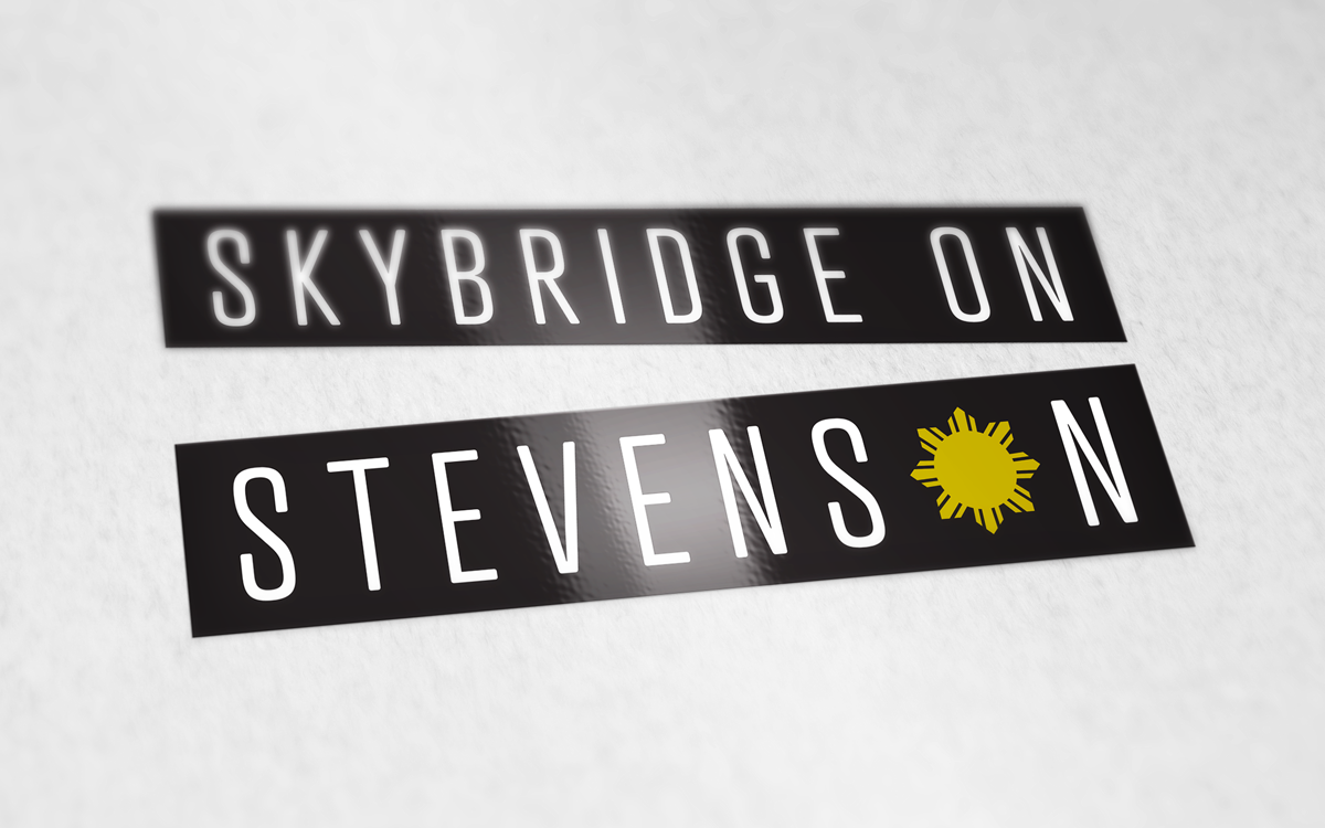
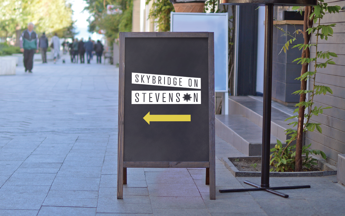
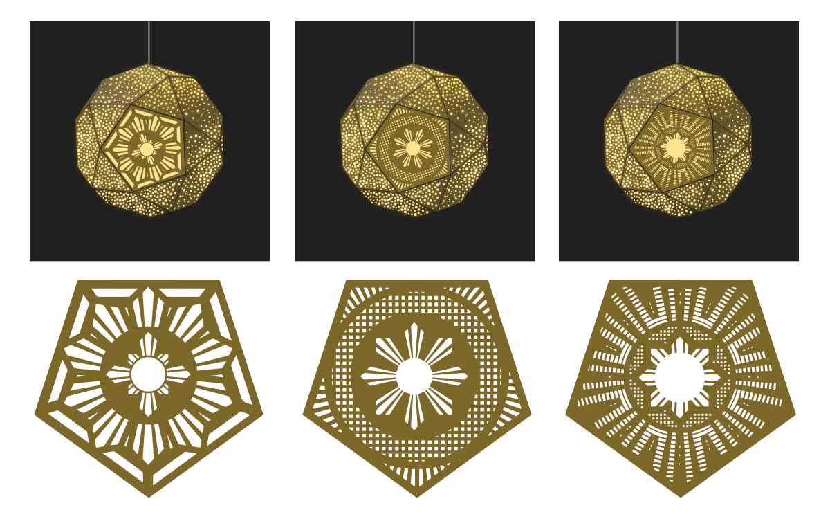
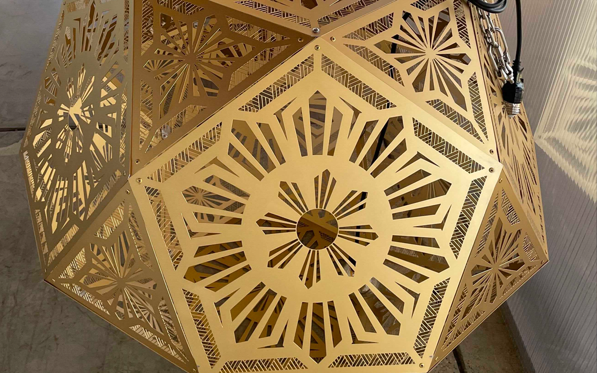
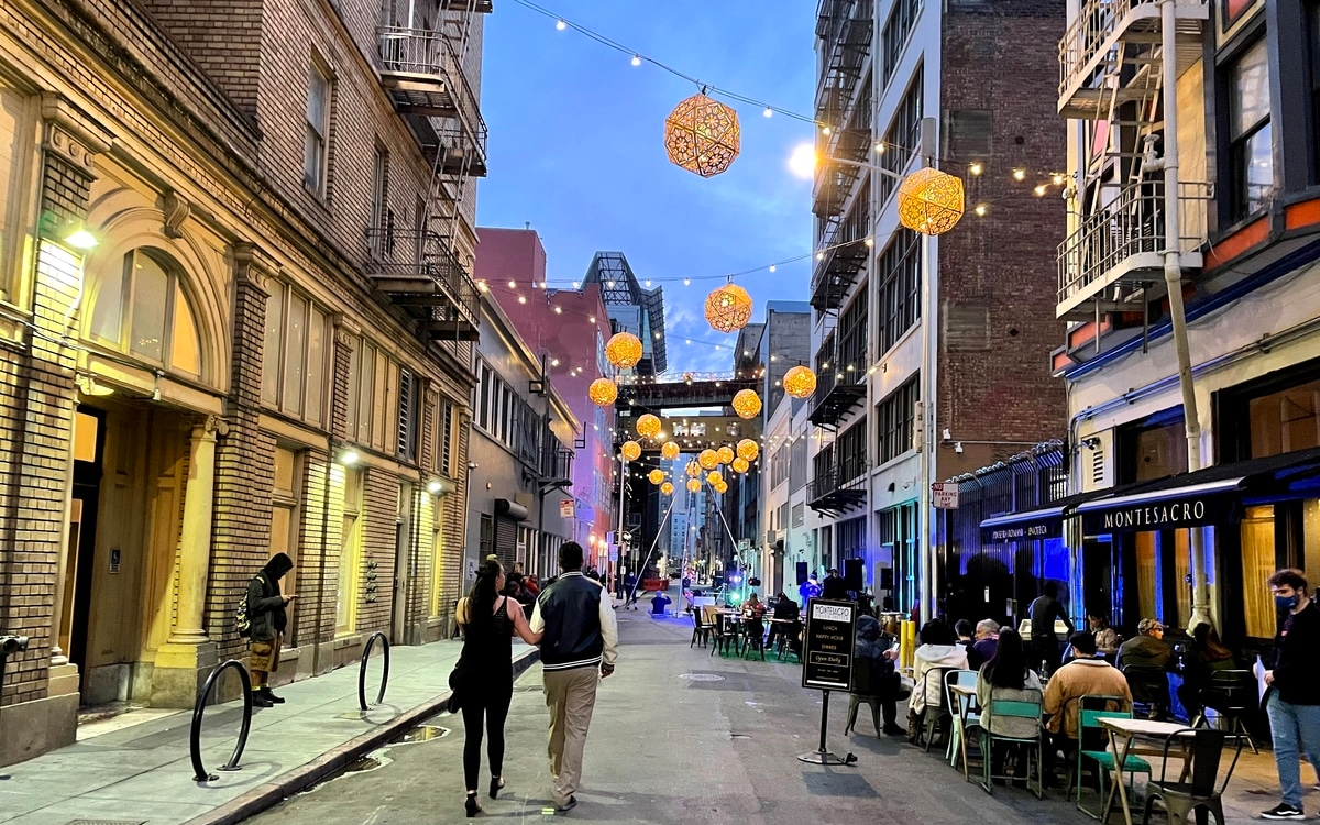
Skybridge On Stevenson brand assets + lantern concepts - Art Direction + Design by Dre Sibayan
I hope there are at least two or three moments created as a result of something I’ve made that make people FEEL something.
As the saying goes, “people won't remember what you said, but they will remember how you made them feel.”
And if anything, I want to leave this Earth, be known in history with the way my design or art was able to move someone, emotionally.
JF: Thank you. It makes me feel hopeful and optimistic. Sharing that layer of explanation, I remember the purple and teal for Undiscovered and it's so recognizable in my head that there’s a vibrant feeling that translates through color.
What advice would you give to Filipino artists and designers in the industry right now?
DS: From the perspective of being a Filipino American artist — Represent your Filipino-ness in your artwork if that is important to your style. But you don’t have to.
Be proud of who you are.
Celebrate your individual weirdness.
As one of my best friends Marco would say, “Do you baby!”
Sometimes you know how to express this right away— and sometimes it takes a long time to figure out what that is…. and that’s ok. Keep trying new things. Curiosity is an asset!
If you’re wondering how you can benefit the culture through your craft — go teach.
Drawing inspiration from martial arts culture, part of the progress of belt progression is to be responsible for those coming after you. Those that are still learning. Whether it’s Karate or Jiu Jitsu. If you want to belt up, you gotta teach.
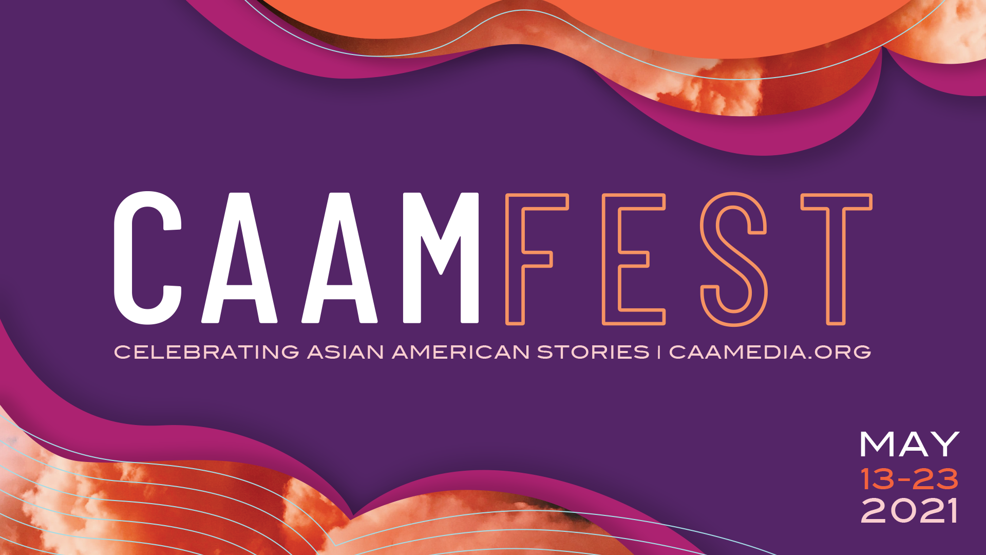
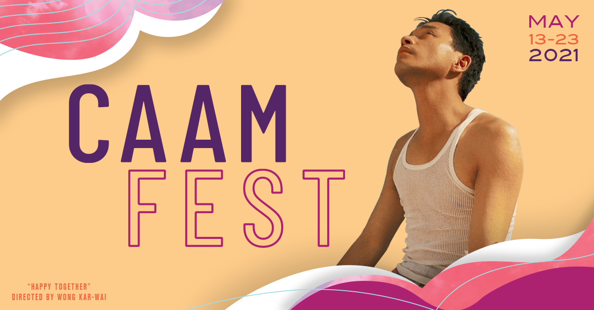
Various brand assets for CAAM FEST 2021 and CAAM STORYTELLERS campaign 2021 - Art Direction + Design by Dre Sibayan
I think it’s the same thing with art and design. Educating someone else in your craft helps you remember what you know, but also highlights what you don’t know. By passing your knowledge, you are then not only adding to the lineage of it but reminding yourself how you can improve as well. I’m not talking about becoming a teacher per se, but maybe show someone a shortcut to process things in photoshop. Or how to take better pictures. Or maybe mentor somebody!
Better students + better teachers = better culture.
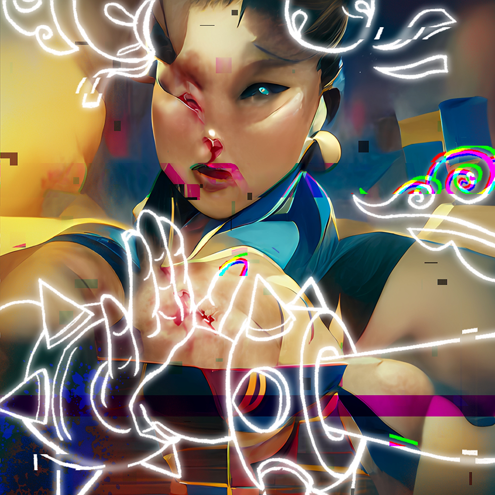
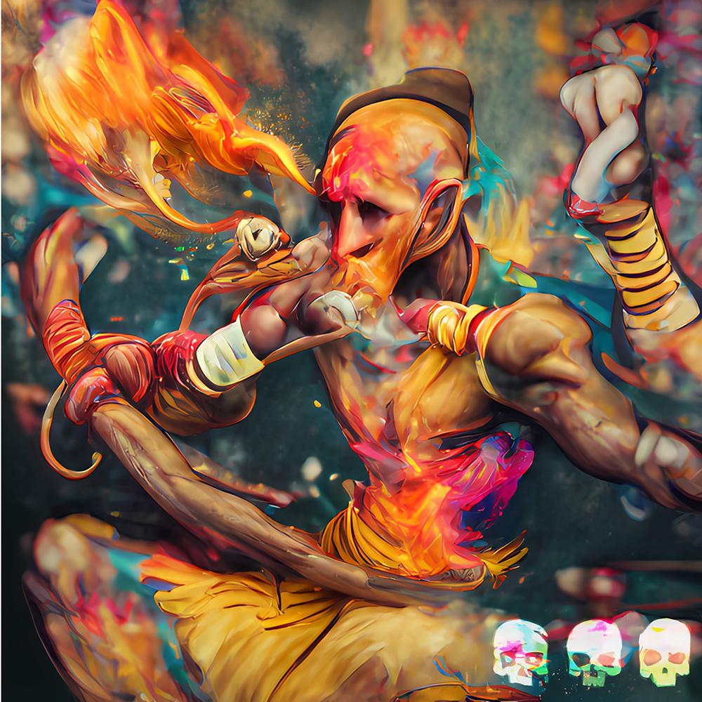

NFTs exploring the combination of illustrative design and AI art generation by Dre Sibayan
My general advice for Filipinx creatives coming up, is to be proud of your heritage, but you don’t have to feel bound by it. Allow the greatness in your work to be the beacon that attracts others to recognize, share, and participate in it.
Be a forever white belt. Always learning. Master your craft by learning from the mistakes you've made along your path.
Humbleness is an unsung key to greatness.
There are so many talented Filipinx artists and creators in EVERY industry you can think…that you probably have never heard of. They all deserve their own blog post! I’m just one voice in that sea of exceptional talent. So for me to say what defines “Filipino Art and Design” is in the Bay and beyond, confines it.
I’m in no way the whole story — just an artist fortunate enough to be a short chapter inside of it.
I can’t wait to see what happens next.

Balay Kreative cover design 2020 - Art by Dre Sibayan